This concept reimagines Indian currency with vertical orientation, featuring diverse role models like Lata Mangeshkar, APJ Abdul Kalam, and Subhas Chandra Bose—transforming everyday transactions into moments of cultural connection and inspiration.
Currency notes are more than monetary instruments—they are powerful storytelling devices that circulate through millions of hands daily, carrying narratives of identity, heritage, and aspiration.
Each note becomes a canvas for communicating values, honoring achievements, and inspiring future generations. This design reimagines currency as a medium for cultural dialogue and contemporary role modeling.
Unlike traditional mediums that require active engagement, currency enters the lives of people naturally—in pockets, wallets, and transactions. This ubiquity creates unprecedented opportunities for representation.
Iconic Portraits
By featuring figures like Lata Mangeshkar (music), A.P.J. Abdul Kalam (science), and Subhas Chandra Bose (leadership), this currency celebrates excellence beyond political or traditional domains.
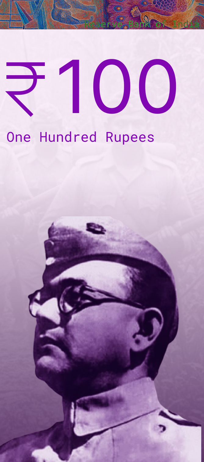
Subhas Chandra Bose
Military uniform portrait emphasizing leadership and determination. Distinctive features—glasses, cap, and determined gaze—create instant recognition.
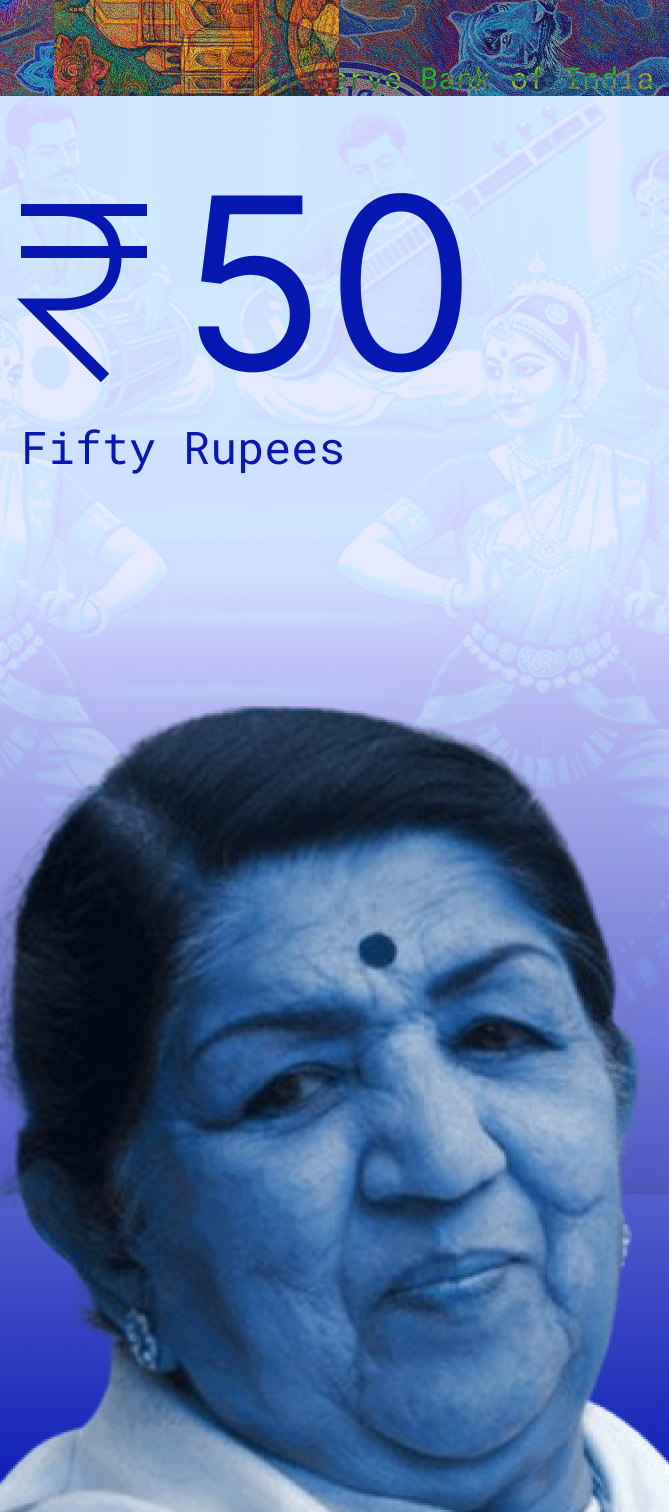
Lata Mangeshkar
Close-up portrait celebrating India's musical heritage. Traditional bindi and classical pose honor one of India's most beloved cultural figures.
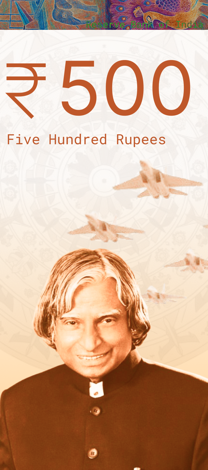
A.P.J. Abdul Kalam
Warm, approachable portrait with distinctive hairstyle embodying scientific achievement and national pride. Immediately recognizable.
Design Decisions
Every element has been meticulously chosen to balance aesthetic beauty, functional clarity, and inclusive accessibility.
Color Palette
Each denomination features a distinct, vibrant color that serves both aesthetic and functional purposes—creating instant recognition while celebrating India's rich visual heritage.
The monochromatic portraits integrate seamlessly with each note's color theme, creating visual harmony while maintaining distinctive character.
Typography System
A dual-font system ensures optimal legibility and modern aesthetic while supporting clear hierarchy.
Numerals — Inter: Exceptional clarity for numerals at all sizes. Geometric precision ensures instant recognition of denominations, even from distances.
Text — Roboto Mono: Monospaced character provides uniform spacing that enhances readability for secondary information.
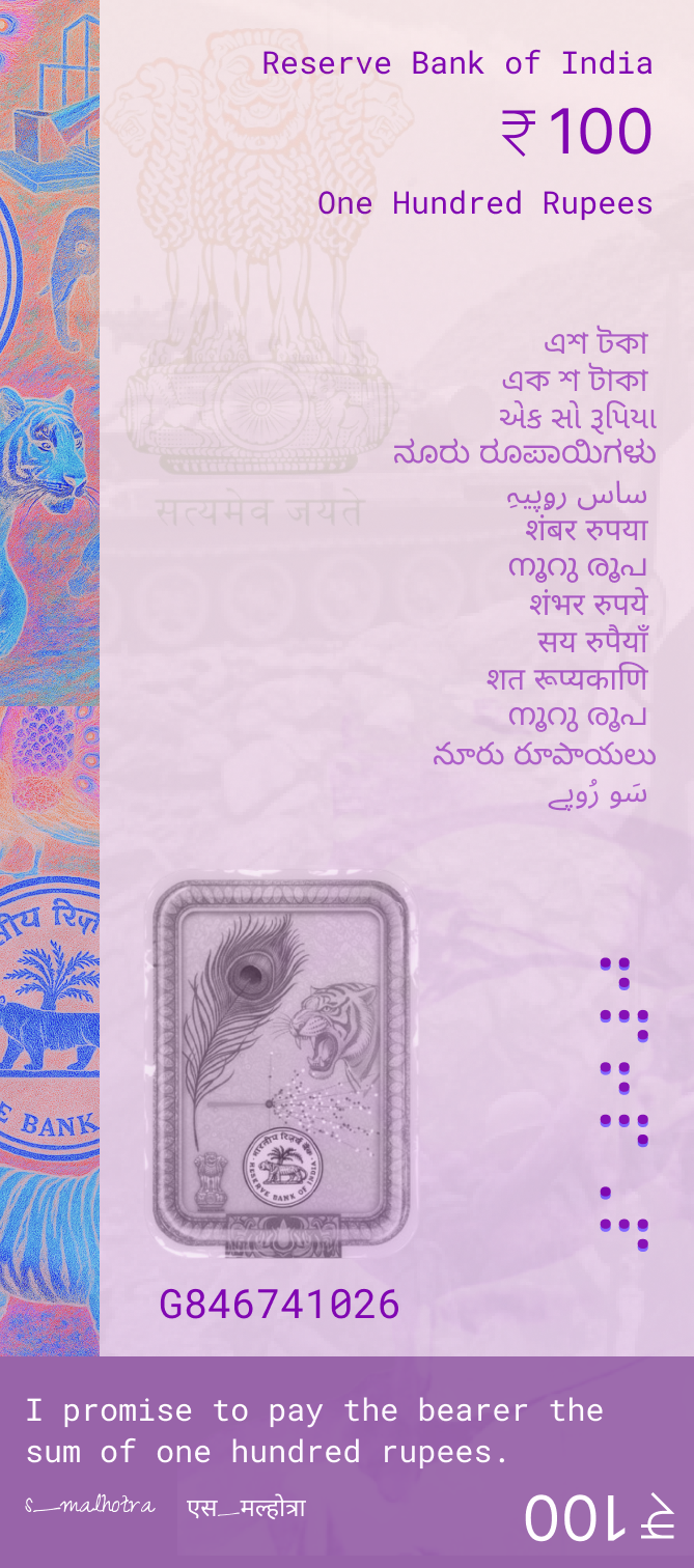
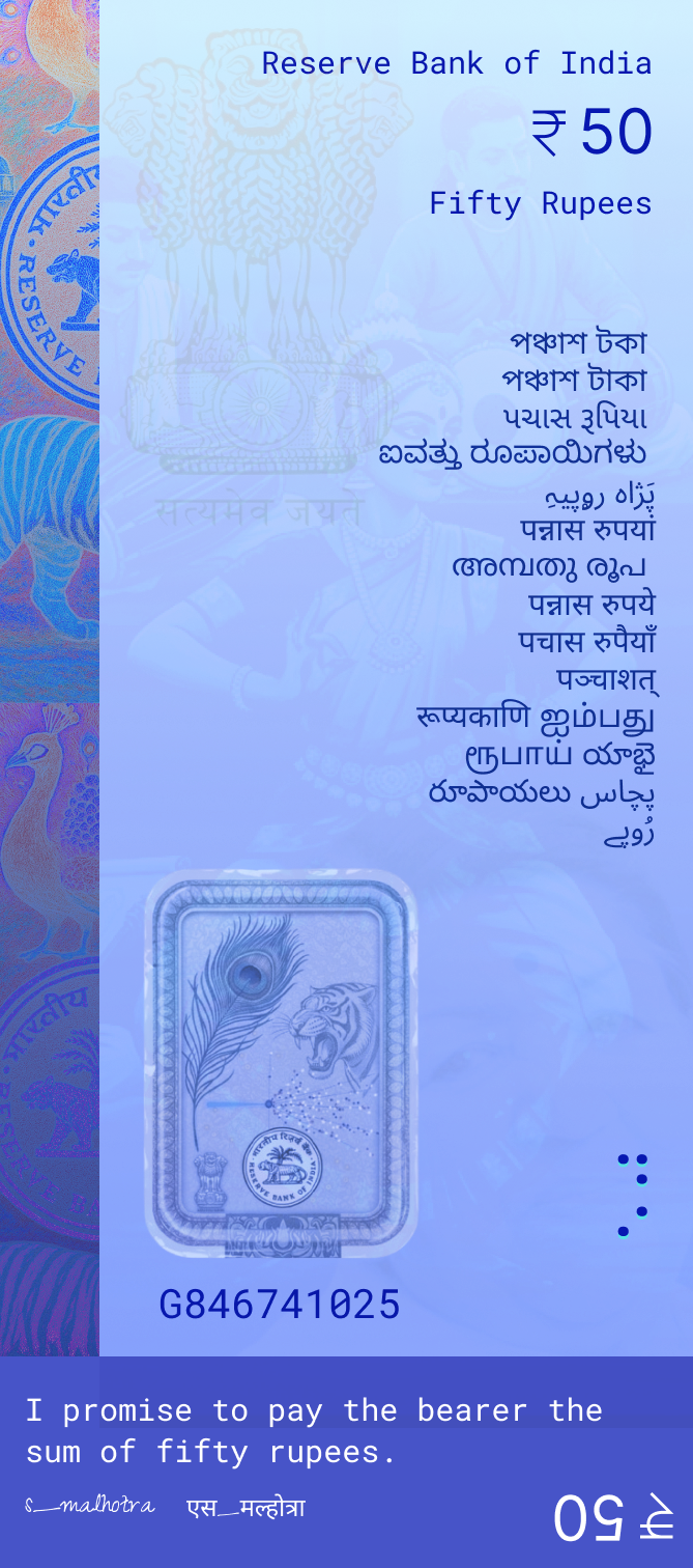
Accessibility: Braille Integration
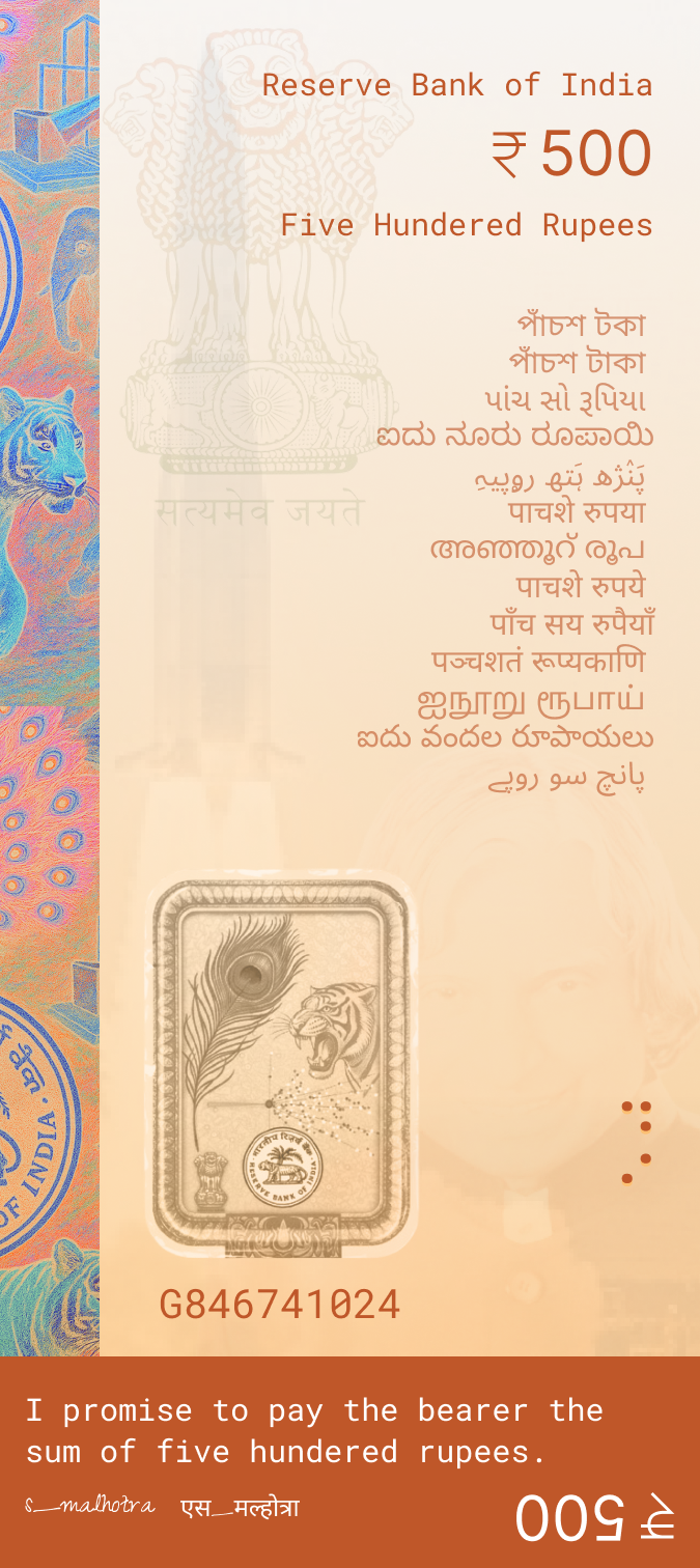
Inclusivity is embedded at every level. Tactile Braille elements enable visually impaired users to identify denominations through touch.
The vertical format provides optimal space for Braille placement without disrupting visual design. Braille dots are positioned strategically along edges, ensuring easy access while maintaining aesthetic integrity.
Vertical Orientation
The decision to adopt a vertical orientation—similar to currency designs in Canada, Switzerland, and other modern economies—represents a fundamental shift in currency design philosophy.
Portrait Dominance
The vertical format allows iconic portraits to occupy the full height, creating powerful, memorable presence.
Modern Aesthetic
Aligns with contemporary design trends seen in digital interfaces and mobile devices. Signals forward-thinking.
Natural Grip
Matches how people naturally hold currency notes, making them more ergonomic and comfortable in hand.
Improved Legibility
Text flows naturally top-to-bottom. Denominations visible when notes are stacked or held naturally.
Better Stacking
Vertical notes stack more efficiently in wallets and cash drawers. Easier to count and organize.
Enhanced Security
Security features positioned more strategically. Watermarks and threads run vertically, harder to replicate.
Cultural Storytelling
Clear narrative structure—top patterns represent heritage, middle shows value, bottom honors icons.
Digital Adaptability
Translates better to mobile banking apps and digital wallets. Consistency across physical and digital.
Language & Communication
The design prioritizes clarity through a thoughtful approach that ensures accessibility while maintaining visual elegance.
- English Primary: All denominations shown in English numerals and text ensures international recognition and global usability.
- Universal Symbols: The ₹ symbol is universally understood across languages, transcending written communication barriers.
- Visual Hierarchy: Numbers and currency symbols are language-independent, supporting accessibility for diverse users.
- Cultural Context: Traditional patterns in the top border incorporate visual storytelling that transcends language barriers.