r/DesignSystems
How we scaled our design tokens across 12 products
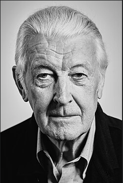
Dedicated to Matthew Carter
A utilitarian design language—condensed type, legible at small sizes, economical. Built for lists, tables, and dense information.
Matthew Carter spent decades shaping how millions read—from Bell Centennial, engineered for flawed phone-book printing, to Verdana, built for low-resolution screens. This system channels that same conviction: every typographic choice must earn its place through measurable legibility, not aesthetic preference.
Color, type, tokens, icons, grid, spacing, and elevation—the building blocks that sync design and code.
The palette takes its cue from Bell System directories: near-black ink on off-white stock, with a single institutional blue for wayfinding. We avoided warm tones deliberately—warmth implies editorial personality, while this system prizes neutrality and data clarity. The blue accent (#0066b3) was chosen for its WCAG AAA contrast against both the paper background and white text, so it works as a link color, a button fill, and a chart highlight without adjustment.
IBM Plex Sans Condensed was chosen for a specific reason: it is one of the few open-source condensed families with a genuinely high x-height and open counters at small sizes. Carter's Bell Centennial solved the same problem—legibility under adverse conditions—and IBM Plex Condensed carries that DNA into screen rendering. The condensed width lets us fit 20–30% more information per line than a standard-width sans, critical for tables, lists, and dashboards. We use four weights (400–700) to create hierarchy without changing typeface.
Named variables (e.g. --color-brand-primary, --space-4) that sync design and
code.
Icons are stroke-based at 24×24 with stroke-width 2 to match the visual weight of IBM Plex Condensed at body size. Filled icons would compete with the condensed type's tight rhythm; strokes keep the icon grid airy. Every icon must be paired with a text label or ARIA tooltip—icon-only buttons fail usability tests for directory-style interfaces where speed of scanning matters.
Column counts, gutter widths, and responsive breakpoints.
The 8px base grid reflects a simple principle: tighter spacing than typical SaaS products. Where most systems use 16px as the base increment, we halve it because dense data UIs need rows and columns to sit close together. The --space-2 (8px) is the default cell padding; --space-4 (16px) creates comfortable section breaks. Larger values (48–96px) are reserved for page-level breathing room between major content zones.
Z-index layers and shadow styles for depth.
Components are designed for data-entry speed and scanning efficiency. Buttons use the condensed typeface at 14px with minimal padding—large touch targets are less important here than fitting controls alongside dense content. The 4px border-radius is the only decorative element; it softens hard edges without introducing the rounded-pill aesthetic that signals consumer apps.
Four button types cover every interaction pattern. Primary (filled) for the single most important action on screen. Secondary (outlined) for supporting actions. Ghost (borderless) for tertiary or inline actions. Danger (red) exclusively for destructive operations. The loading state uses a CSS spinner to prevent double-clicks on slow network operations.
Form inputs prioritize rapid data entry. The focus ring uses a 3px box-shadow in ink-black at 10% opacity—subtle enough to avoid visual noise in dense forms, but clearly visible for keyboard navigation. Labels are always above inputs (never inline placeholders) because directory editing workflows often involve tabbing through dozens of fields.
Navigation components use the condensed type at small sizes with clear active states. The tab pattern uses a bottom border indicator (2px) rather than background fills—this keeps the horizontal space tight while maintaining an obvious visual distinction between active and inactive tabs.
Feedback components use high-contrast semantic colors against dark or white backgrounds. Toasts are intentionally compact—they must not obstruct the data grid below. Modals use a light backdrop (40% black) to maintain context awareness, and their dialogs inherit the 8px border-radius to feel contained without being ornate.
Body copy for the dialog.
60%
Tables are the native habitat of this system—the entire type and spacing system was designed to make tabular data scan quickly. Row hover states use neutral-50 to create a reading guide without overwhelming the grid lines. Badges use muted semantic backgrounds (light green, amber, red) to indicate status at a glance.
| Name | Extension | Dept |
|---|---|---|
| Anderson, J. | x3401 | 12 |
| Brown, M. | x3402 | 12 |
| Clark, S. | x3403 | 07 |
Short description.
Short description.
Short description.
Sliders and segmented controls.
The directory list is the signature pattern of this system—directly descended from the phone book. Name–number pairs with dotted leaders, alphabetical ordering, and compact row height. Carter designed Bell Centennial to survive the brutal conditions of newsprint directory printing; this digital version inherits that philosophy by keeping rows tight (single-line, no wrapping) and using condensed type to maximize entries per viewport.
A design system proves itself when applied to real products. The mobile examples below test whether condensed type and tight spacing hold up on small screens. The cross-platform examples that follow demonstrate scalability—the same token system driving a smartwatch notification, a mobile feed, a laptop dashboard, and a TV channel guide.
 You
You
 jane_d
 dev_mike
 design_
jane_design
design_
jane_design
| Batter | R | B |
|---|---|---|
| R Sharma | 67 | 82 |
| V Kohli | 54 | 61 |
| S Iyer | 22 | 28 |
Bowling: Starc 7-0-42-1
34.2 Kohli drives through cover for four. 187/3.
34.1 Single to midwicket. Sharma on strike.
33.6 Starc to Iyer. Dot ball. End of over.
33.5 Two runs. Quick running between the wickets.
33.4 Iyer flicks to fine leg for one.
33.3 Defended back to the bowler.
The same design tokens adapt to radically different screen sizes. Condensed type is particularly well-suited to constrained interfaces — it was literally invented for this purpose.
Patterns are opinionated assemblies of components. They encode product-level decisions—how search should feel (fast, inline, filterable), what an empty state communicates (invitation, not frustration), and how authentication balances security with speed. Every pattern was designed to work within the condensed, data-dense aesthetic.
Get started by adding your first item.
Try adjusting your filters or search.
A system without rules is just a collection of components. Governance ensures every new contribution upholds the same economy and legibility standards that define the system. These rules are intentionally strict—when you optimize for data density, even small deviations in spacing or contrast compound quickly.
aria-label on icon buttons, aria-live for dynamic
content, role="dialog" for modals..btn .btn-primary, .form-input.
Override :root for theming.
34.2 Kohli drives through cover for four. 187/3.
34.1 Single to midwicket. Sharma on strike.
33.6 Starc to Iyer. Dot ball. End of over.
33.5 Two runs. Quick running between the wickets.