Developing Novel Research Methods
To uncover forward-looking user needs related to context (time) and emotion, I developed and applied the following two methods:
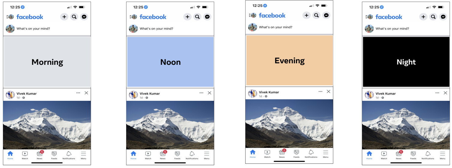
Method 1: Time Loop - Understanding Temporal Needs
Guiding Question: What do users want to see, and when?
Rationale: Intuitive interfaces often align with users' daily rhythms. This method aimed to understand how Facebook Home could better integrate into users' lives by exploring their needs and preferences at different times of the day.
Execution: Participants were presented with visual cues representing various times/scenarios throughout a typical day (e.g., waking up, commuting, evening relaxation). For each cue, we discussed how Facebook Home could be most helpful or relevant at that specific moment using prompts like:
"It's this time of the day, and you open the Facebook app; what would you ideally like to see first?"
"After a busy day, you return home... You open Facebook. What would you hope to find?"
Interviews were semi-structured and adapted based on the participant's context (e.g., student vs. working professional).

- Emphasizes user routines, revealing opportunities for seamless integration (e.g., "I'd like to see the weather on Facebook Home first thing in the morning.").
- Facilitates pattern identification across diverse user needs and desired features (e.g., desire for positivity, birthday reminders: "...showing whose birthday it is and an easy way to share birthdays would be really good.").
- Strongly user-centered, empowering participants to articulate specific desires (e.g., winding down: "...it would be nice to see some positive affirmations to wind down...").
- Unveils secondary contextual factors beyond time (e.g., location/activity affecting content preference: "I'm not keen on viewing Reels while traveling...").
- Risk of reticence: If participants aren't vocal, prompting them to walk through their entire day and connecting potential features to specific activities can help.
- Potential for feature overload: Participants might suggest including too much. Researchers should focus on gathering all ideas initially and prioritize during analysis.
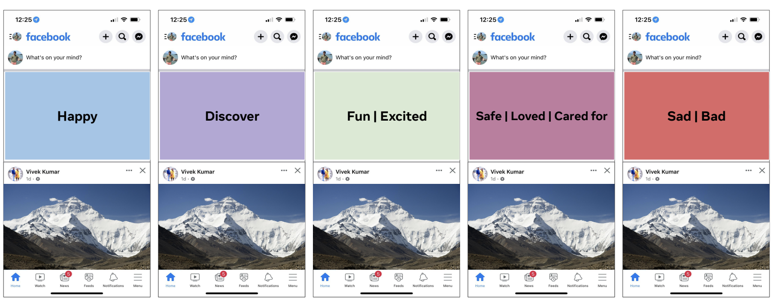
Method 2: Feeling Cues - Connecting Content to Emotion
Guiding Question: How do you feel, and what content resonates?
Rationale: Facebook serves diverse emotional needs beyond just entertainment or connection. This method aimed to understand how content on Facebook Home could better align with or support users' various emotional states and intents.
Execution: We presented participants with visual cues representing different feelings or emotional states (e.g., connected, informed, relaxed, inspired). For each cue, we explored what kind of content or features on Facebook Home could evoke or support that feeling, asking questions like:
"What could we display on Facebook Home that would make you feel or connect with [presented keyword/feeling]?"

- Identifies content types and formats that resonate emotionally (e.g., connecting feelings of love/security to seeing content from close friends/family).
- Helps curate themes based on participant interests that support desired emotional states (e.g., positive mental health quotes being valued after work).
- Requires deep probing: Brief answers (e.g., "puppy content for happiness") need follow-up questions about preferred format (video, reel?) and the underlying 'why'.
- Subjectivity challenges theming: Defining universal themes from subjective emotional responses can be complex.
- Focus on 'What', not 'When': Better suited for identifying *types* of emotionally resonant experiences rather than pinpointing the exact *timing* for them.